


Like the best high-street shopfronts, your website layout has seconds to earn trust and get the enquiry. You’ll convert more local UK visitors when your phone number, hours, and service area sit above the fold, with a sticky tap-to-call or book button on mobile. Keep navigation lean, push one clear value proposition, and back it with reviews, badges, and a visible guarantee. Miss any of these, and you’ll see where bookings quietly leak…
Key Takeaways
- Lead with a clear value proposition above the fold, then reinforce it with reviews, accreditations, and a single primary CTA.
- Keep contact details visible everywhere: tappable phone, hours, and location in a sticky header, prioritising mobile click-to-call.
- Reduce friction by limiting navigation to 5–7 essential pages and making the next step obvious on every screen.
- Place trust elements near risk points: review strips by pricing and areas covered, and badges/guarantees beside forms and quote steps.
- Structure service pages for intent: problem-solution, pricing cues, process, FAQs, testimonials under hero claims, and repeated CTAs after proof points.
Local Business Website Layout Conversion Checklist
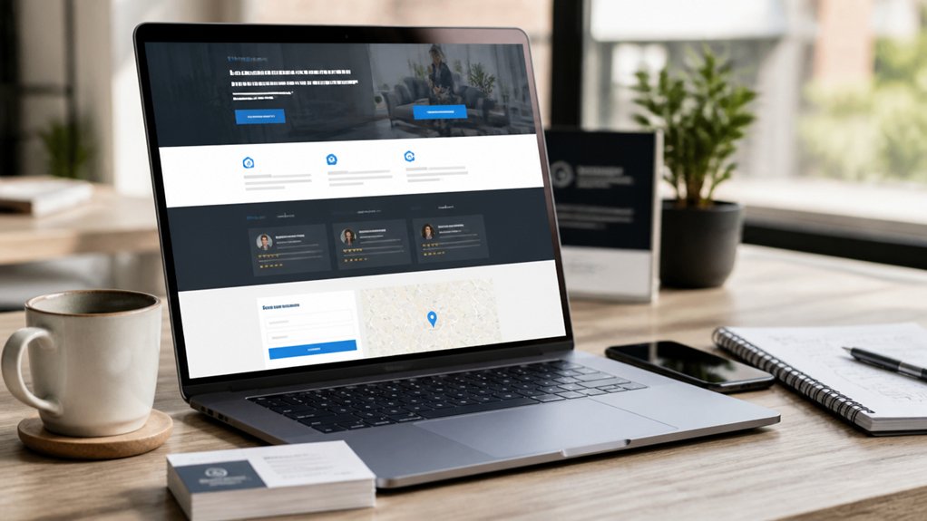
Although every local market in the UK has its quirks, high-converting website layouts follow the same fundamentals: reduce friction, build trust fast, and make the next step obvious. Use this checklist to lift enquiries and bookings without redesigning from scratch.
Start with Brand consistency: keep logos, colours, and tone uniform so visitors recognise you across Google, Facebook, and your site. Apply Visual hierarchy: lead with a single value proposition, then proof, then one primary CTA. Keep navigation to 5–7 items, and prioritise your money pages.
Add trust blocks: review snippets, accreditations, guarantees, and clear service areas (e.g., “covering Leeds and surrounding postcodes”). Speed matters in the UK on mobile; aim for sub-2.5s LCP. Reduce form fields to essentials and confirm next steps instantly.
Put Phone, Hours, and Address Above the Fold
Once you’ve tightened hierarchy, speed, and trust signals, make it effortless for visitors to contact you by putting your phone number, opening hours, and address (or service area) above the fold—especially on mobile.
UK users often decide in seconds; if they can’t see essentials instantly, they bounce and try the next local listing. Build Contact visibility into your layout: show a tappable phone number, today’s hours, and a location line with postcode or “Serving X miles around Leeds”.
Give these details Header prominence, not a hidden footer link. Use a sticky header that doesn’t crowd the screen, and format hours for quick scanning (e.g., “Open now” plus next close time).
Pair it with consistent NAP across site and Google Business Profile to reduce doubt and lift enquiries.
Homepage Website Layout That Gets Calls Fast
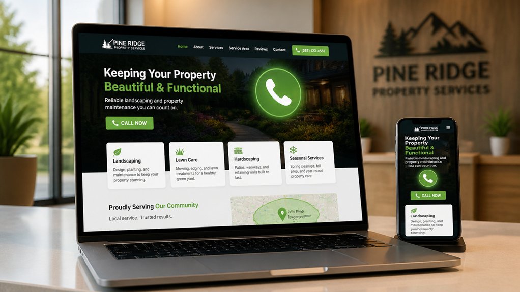
You get more calls when you make the next step obvious: place an above-the-fold call button so mobile visitors can ring you in one tap.
Reinforce that decision with trust signals near the header—Google reviews, trade accreditations, and local service areas—so you reduce hesitation fast.
Keep a persistent click-to-call contact bar as they scroll, because in the UK most local-intent traffic is on mobile and every extra tap costs conversions.
Above-The-Fold Call Button
One above-the-fold call button can lift phone enquiries fast, especially on mobile-first UK traffic where most local searches start and finish on a handset.
Put a single, high-contrast “Call now” button in your call to action placement, top-right or sticky bottom, so it’s always one tap away.
Keep the copy specific (“Call for a same-day quote”) and align it with your opening headline.
Use click-to-call (tel:) and track taps in GA4 so you can see which pages drive calls, not just visits.
In above the fold design, remove competing links and keep the hero tight: one message, one action.
Test button colour, size, and wording weekly; even a 0.5% lift compounds across hundreds of local sessions monthly.
Trust Signals Near Header
Three trust signals placed tight to your header can lift call-through rates because they reduce hesitation in the first 3–5 seconds of a homepage visit. Put them beside your logo and primary navigation so they’re seen before anyone scrolls.
First, show a UK-local proof point: your Google rating with review count (e.g., 4.8★ from 213 reviews) to signal volume and recency.
Second, add authority badges that matter locally—Gas Safe, NICEIC, CHAS, Which? Trusted Traders—so you borrow credibility instantly.
Third, surface one line of customer testimonials, ideally location-specific (“Croydon”, “Leeds”), to anchor trust in proximity.
Keep each signal compact, consistent, and verifiable; link badges to IDs and reviews to sources. That combination reinforces brand authenticity and speeds decisions.
Click-To-Call Contact Bar
Because most local customers land on your homepage with intent to book, price-check, or confirm availability, a click‑to‑call contact bar turns that intent into calls before they get distracted.
Pin it to the top on mobile and desktop, show your local number, and add “Call now” plus opening hours for UK time zones. Keep it tap-sized (44px+), high-contrast, and persistent on scroll, so it’s always one action away.
Route calls through dynamic number insertion and call analytics, so you can attribute enquiries to PPC, SEO, and Google Business Profile.
Add a secondary option like “Request a callback” for out-of-hours to protect conversions.
Track taps as events to measure user engagement, then A/B test wording, colour, and placement weekly.
Service-Page Layout That Ranks and Converts Locally
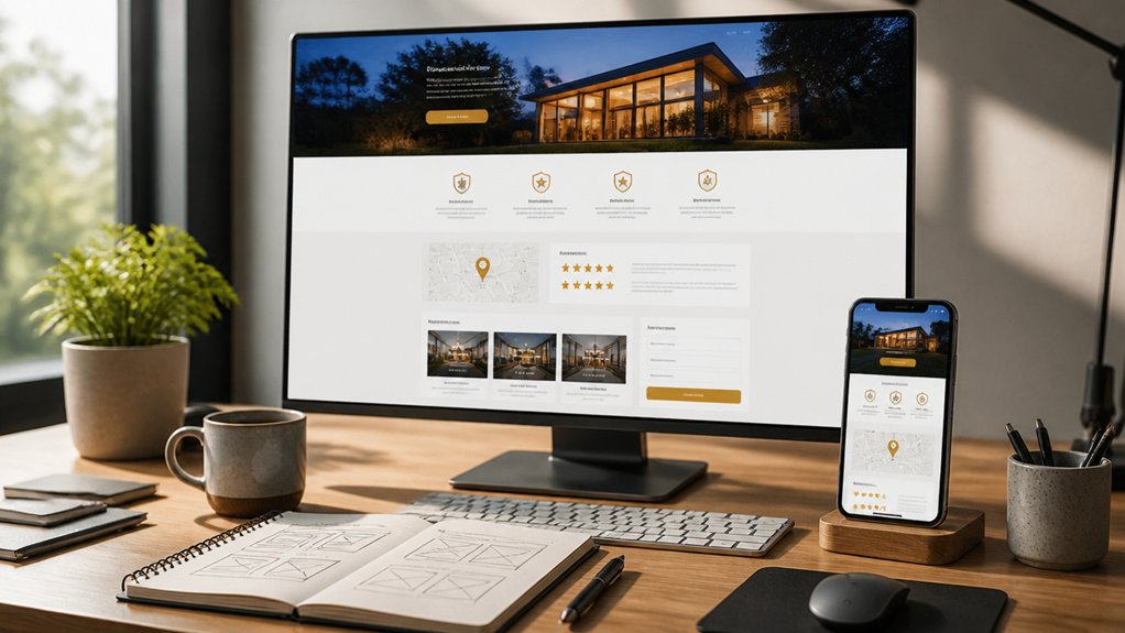
While your homepage might grab attention, your service pages usually win the local leads—especially when they match UK search intent and remove friction fast.
Build one page per core service + area (e.g., “Boiler Repair in Leeds”) and keep the URL, H1, and intro aligned to that phrase.
Use content hierarchy to guide scanning: problem, solution, pricing signals, process, FAQs, then a strong CTA.
Add a service-specific summary above the fold with turnaround times, coverage radius, and whether you’re Gas Safe, NICEIC, or insured (without deep trust blocks).
Keep design aesthetics clean: high-contrast buttons, 16px+ text, and fast-loading images.
Include schema (LocalBusiness + Service), internal links to related services, and unique location copy to avoid thin pages.
Track calls, form starts, and scroll depth.
Where to Place Reviews, Badges, and Guarantees
If you place social proof and risk-reversal where people hesitate, you cut drop-offs and lift enquiries.
Put Customer testimonials directly under the hero claim on service pages, so visitors see proof before they scroll.
Add a short review strip beside your “Areas we cover” and pricing cues, because postcode relevance and cost trigger doubt in UK searches.
Place trust badges (Trading Standards, Which? Trusted Traders, Checkatrade, PCI, GDPR) next to forms and quote steps, not buried in the footer.
Use guarantees where risk peaks: above the price table, beside availability, and before the final submit.
Keep them specific: “24‑hour response”, “fixed quote”, “no call‑out charge”, “workmanship warranty”.
Repeat one strong review near FAQs to neutralise objections fast.
Mobile-First Calls-to-Action (Tap, Text, Book)
Social proof and guarantees reduce hesitation, but on mobile you still win or lose on what happens next: the tap. Put a sticky “Call” and “Book” bar in thumb reach, with one primary action per screen.
Use click-to-call with your UK number format, and add “Text/WhatsApp” for commuters who can’t talk. Tight microcopy like “Book in 30 seconds” lifts intent because it sets an outcome and a time cost.
Make CTAs feel instant: prefill forms, use calendar slots, and confirm with SMS so you cut drop-offs.
Interactive design matters—tap states, progress steps, and clear feedback raise user engagement. Track taps, call connects, and bookings in GA4, then A/B test labels, colour, and placement weekly.
Layout Mistakes That Block Calls and Bookings
If your phone number and booking link are hidden in a footer or buried behind menus, you’re forcing UK customers to hunt—and every extra tap cuts conversion rates.
You’ll lose calls when your primary CTA sits below the fold, competes with sliders, or changes position between pages.
Fix starts with making contact details persistent and placing one clear “Call” or “Book online” CTA where it’s visible immediately on mobile and desktop.
Hidden Contact Information
Where do customers look first when they’re ready to call or book? They scan your header, top-right area, and mobile sticky bar. If your Hidden contact details sit behind a hamburger menu, footer, or “Contact” page only, you force extra taps and drop intent.
UK users are often on mobile and moving; every added step increases abandonment and pushes them to a competitor in the local pack. Put your Contact information in persistent, high-visibility zones: phone number, opening hours, and a postcode/area served.
Use click-to-call on mobile, and keep the number in text (not an image) so it’s tappable and searchable. Add consistent details across pages to reduce doubt and speed decision-making.
Weak Call-To-Action Placement
Visible contact details get you halfway there; weak call-to-action placement still lets high-intent visitors drift. If your “Call now” or “Book a visit” button sits below the fold, hides in a menu, or competes with sliders, you’ll leak enquiries—especially on mobile, where most UK local searches happen.
Put one primary CTA in the top-right header, repeat it after key proof points, and keep it sticky on phones. Use a single colour with high contrast, a clear verb, and a UK-specific promise (“Same-day quote”, “No call-out fee”).
Track click-to-call and form-start rates in GA4, then A/B test position and wording weekly. Smart layout optimization turns traffic into calls, bookings, and revenue through better call to action placement.
Conclusion
You don’t win local jobs with pretty pages; you win with frictionless layouts. Put your phone, hours, and address above the fold, then back them up with reviews, badges, and a clear guarantee—so visitors trust you fast. On mobile, a sticky tap-to-call, text, or book button beats buried menus every time. Your service pages should rank and convert: tight headings, local proof, and one primary CTA. Remove clutter, and bookings rise.