

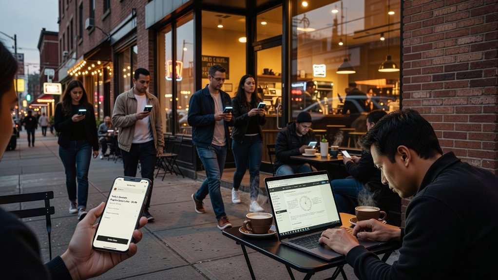
If you run a neighborhood bakery and your mobile site takes 6 seconds to load, you’ll watch hungry “near me” searchers bounce to the shop that opens fast and shows tap-to-call. You need a responsive, quick website that wins local SEO, earns trust, and turns visits into calls, bookings, and direction requests. The difference often comes down to a few mobile speed and UX fixes, but which ones matter most…
Key Takeaways
- Google ranks sites by mobile experience; fast pages improve visibility in “near me” searches and map pack results.
- Speed reduces bounces and increases engagement, keeping local shoppers from leaving when they need quick answers.
- Mobile-friendly layouts make calling, booking, and getting directions effortless with thumb-friendly buttons and above-the-fold contact details.
- Faster, stable pages build trust; delays and layout shifts make customers doubt professionalism and reliability.
- Optimizing Core Web Vitals (LCP, INP, CLS) boosts usability and conversions through compressed images, lean code, caching, and fewer heavy scripts.
What Is a Fast, Mobile-Friendly Website?

If your customers land on your site from a phone, a fast, mobile-friendly website loads in seconds, fits any screen, and makes it effortless to take action. You build it with responsive design, compressed images, clean code, and lightweight fonts so pages render instantly on mobile data.
You keep navigation thumb-friendly, buttons large, and forms short, so every tap feels frictionless.
A fast, mobile-first site also delivers a consistent User experience from homepage to checkout: clear headings, readable text, and obvious calls to call, book, or get directions. You reinforce trust with strong visual branding—logos, colors, and photos that stay sharp without slowing performance.
You measure speed with Core Web Vitals, then fix bottlenecks to protect conversions every day.
How Does Mobile Speed Impact Local SEO Rankings?
Because Google indexes and evaluates your site primarily through its mobile experience, mobile speed directly influences how well you rank in local search. When your pages load quickly on phones, Google sees a better user experience and is more confident showing you in the map pack and “near me” results.
If your site drags, visitors bounce, engagement drops, and those negative signals can push you below faster competitors—hurting Local rankings even if your reviews are strong.
Speed also affects conversions: a quick tap-to-call, fast menu, and instant directions keep customers moving toward a visit or booking. Pair Mobile optimization with streamlined pages, compressed images, and lightweight scripts so crawlers and customers reach key info without friction.
Faster mobile equals more visibility and more calls today.
Which Mobile Metrics Matter (Core Web Vitals)?
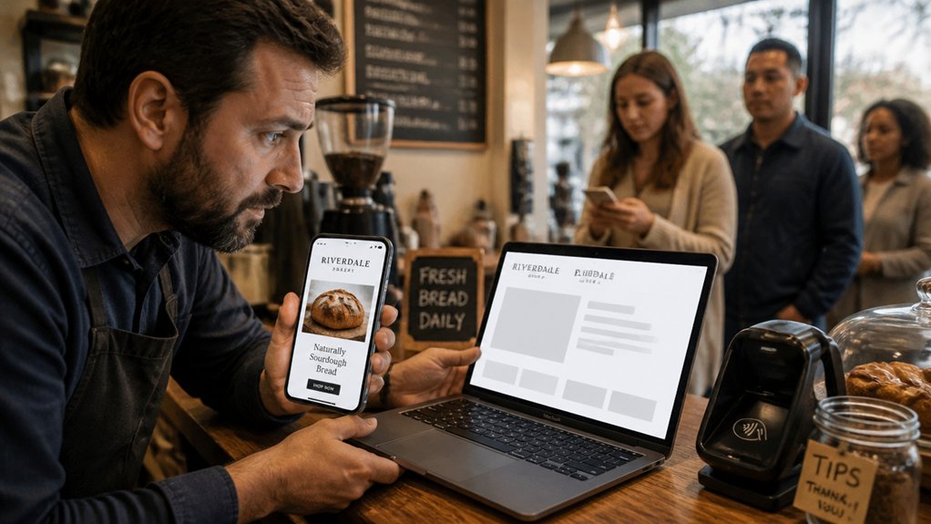
To win local searches on mobile, you need to optimize the Core Web Vitals Google uses to judge real user experience. You’ll focus on LCP for fast load, INP for responsive taps, and CLS for stable layouts—signals that reduce bounces and drive calls, directions, and bookings.
Track these mobile performance metrics in Google Search Console and PageSpeed Insights so you can spot issues fast and fix what’s costing you conversions.
Core Web Vitals Explained
While your site might look fine on a desktop, Google measures how it actually performs on a phone, and Core Web Vitals tell that story in three numbers: how fast your main content loads (LCP), how quickly the page responds to a tap (INP), and how stable the layout stays while it loads (CLS).
When LCP is slow, people bounce before they see your offer, hurting User engagement and local rankings. When INP lags, taps feel broken, and you lose calls, bookings, and direction requests. When CLS jumps, buttons shift under thumbs, creating misclicks that kill trust.
Improve these essential metrics and you’ll support smoother brand storytelling: images appear on time, forms stay put, and CTAs respond instantly. That mobile experience converts nearby searchers into customers.
Tracking Mobile Performance Signals
Even if your desktop site feels fast, you need to track mobile Core Web Vitals—LCP, INP, and CLS—because they reveal whether nearby searchers can actually see, tap, and trust your pages.
Watch LCP to confirm your hero image, map, or phone button renders quickly on cellular, not just Wi‑Fi.
Monitor INP so Mobile gestures like scrolling, tapping “Call,” and opening menus respond instantly, keeping buyers moving toward bookings.
Track CLS to stop layout jumps that cause mis-taps and abandoned carts.
Use Search Console and field data, then segment by device and location to spot real-world slowdowns.
Improve scores with image optimization, lazy loading, and data compression, so pages load faster, rank better locally, and convert more visits into leads.
Why Do Slow Mobile Pages Increase Bounce Rates?
Because mobile users expect instant answers, slow-loading pages push them to hit “Back” before they ever see your offer. On a phone, every extra second feels bigger, especially on cellular data, so impatience turns into bounces fast. When visitors leave quickly, your engagement signals drop and your local SEO can weaken.
You can’t convert people who never reach your menu, booking form, or call button. A laggy mobile user experience also interrupts scrolling, taps, and map lookups, so shoppers abandon mid-task.
Fix it with page load optimization: compress images, trim scripts, enable caching, and prioritize above-the-fold content. Then your key pages load first, keep attention, and guide users to actions like calling, getting directions, or requesting a quote. That’s how speed cuts bounce rates.
How Do Slow Pages Hurt Trust for Local Shoppers?
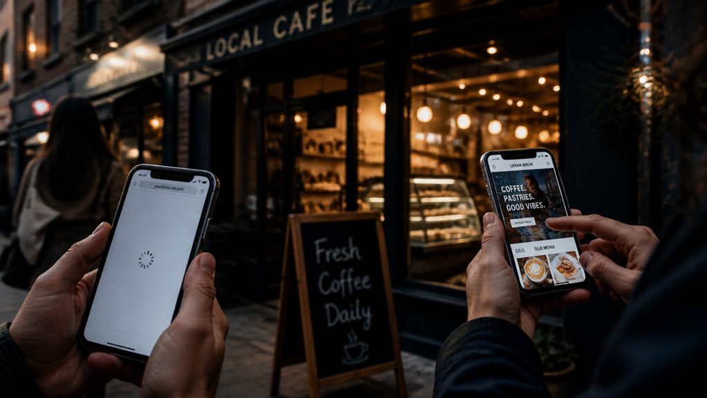
A slow mobile page makes your business look unreliable the moment it stutters. On a phone, shoppers expect instant answers: hours, directions, inventory, and pricing. When your site hesitates, you signal you might also be slow to respond in-store. That weakens Trust building before they ever visit.
Speed shapes User experience, and user experience shapes credibility. Delays make people question security, professionalism, and accuracy, especially when they’re ready to buy nearby. If images pop in late or buttons lag, shoppers assume the site is outdated or neglected. They’ll compare you to a faster competitor and feel safer choosing them.
Searchers also notice when Google loads your listing, then your site crawls. Every extra second adds doubt—and doubt kills local intent.
What Mobile Design Gets More Calls and Leads?
To get more calls and leads from mobile search, you’ve got to make it effortless for customers to reach you fast. Add a prominent tap-to-call button and keep your phone number and contact info above the fold so they don’t have to scroll.
When your mobile website puts contact options front and center, you turn high-intent visitors into real inquiries.
Tap-To-Call Buttons
When someone finds your business on their phone, a tap-to-call button turns that moment of intent into a real lead in seconds. You remove friction, so prospects don’t copy, paste, or abandon the page.
Place tap to call buttons where thumbs naturally land, size them for quick taps, and label them with action-driven text like “Call Now” or “Talk to a Specialist.” Pair the button with click-to-call tracking so you can measure which pages, keywords, and ads generate calls.
Use contrasting color, strong spacing, and fast-loading code to keep mobile engagement high. If you serve urgent needs—repairs, appointments, quotes—tap-to-call boosts conversions because it matches how people buy on mobile today.
Above-The-Fold Contact Info
Tap-to-call buttons work best if shoppers can spot your contact details instantly, without scrolling or hunting. Put your phone number and primary CTA above the fold on every mobile page, especially your homepage, service pages, and location pages. This boosts contact visibility and reduces drop-offs from impatient users.
Use a sticky header with a clear call icon, and keep spacing thumb-friendly so taps don’t miss.
For immediate accessibility, pair the number with your hours, “Get Directions,” and a short trust cue like “Same-day appointments.” Avoid hiding contact info in hamburger menus or footers.
Keep the CTA color high-contrast, label it with action words, and test on real devices. When your contact details appear first, you’ll earn more calls, leads, and walk-ins.
How Do You Make Booking, Buying, and Directions Easy?
Although your site might look great on a phone, it won’t convert unless booking, buying, and getting directions feel effortless. Put your primary CTA above the fold: “Book Now,” “Order Online,” or “Call.” Use tap-friendly buttons, autofill forms, and one-step checkout with Apple Pay/Google Pay to reduce friction and boost Customer engagement.
For appointments, show real-time availability, minimal fields, and instant confirmation texts.
For purchases, keep carts persistent, simplify shipping options, and display totals early to prevent drop-offs.
For directions, embed a clickable map, add “Get Directions” that opens in Google Maps/Apple Maps, and include parking notes and store hours.
Every screen should prioritize User experience, so visitors act fast, not hunt. Track conversions per device and refine CTAs by page.
How Do You Test Mobile Speed and Find Bottlenecks?
Even a beautiful mobile layout can fail if your pages load slowly, so you need to test mobile speed and pinpoint bottlenecks before they kill conversions. Start with Google PageSpeed Insights and Lighthouse in mobile mode, then confirm with real-device testing on LTE/5G.
Check Core Web Vitals—LCP, INP, and CLS—because they correlate with rankings and user engagement. Use Chrome DevTools Performance and Network tabs to spot render-blocking CSS/JS, large images, slow third-party scripts, and excessive redirects.
Review server response time (TTFB) and cache headers to find backend delays. Crawl key local-intent pages (home, services, location, booking) to compare templates and identify patterns.
Validate Mobile accessibility during tests so speed gains don’t break tap targets, menus, or forms.
What Are the Quickest Mobile Speed Fixes?
Once you’ve found what’s slowing your site down, you can usually release faster mobile load times with a handful of high-impact fixes: compress and serve images in WebP/AVIF with responsive sizes, enable Brotli/Gzip plus long-lived caching, remove or defer render‑blocking CSS/JS, lazy‑load below‑the‑fold media, and cut heavy third‑party scripts that delay interactivity.
Next, prioritize font optimization: self‑host fonts, subset characters, preload your primary font, and use `font-display: swap` so text renders instantly.
Keep Mobile animation lightweight by using CSS transforms instead of large JS libraries, and reduce motion for accessibility.
Finally, streamline your above‑the‑fold content: trim hero sliders, minimize DOM bloat, and inline critical CSS so calls‑to‑action appear fast, improving rankings, bounce rate, and conversions.
Conclusion
If you want more local calls, clicks, and walk-ins, you can’t ignore a fast, mobile-friendly website. When your pages load instantly, you rank better in local SEO, show up in “near me” searches, and keep shoppers from bouncing. Speed and clean mobile design build trust, make booking and directions effortless, and turn visits into leads. A slow site feels like waiting for a glacier to deliver your pizza—customers won’t wait.