


If your small business website doesn’t look professional, you lose trust before you’ve even explained what you do. You can fix that quickly by making your pages easier to scan, tightening up your branding, and sticking to two fonts and a simple colour palette that feels right for the UK market. Then you standardise images, clean up icons, and sharpen your mobile speed and calls to action—but the order you tackle these changes matters more than you think.
Key Takeaways
- Make your pages scannable: clear headline, supporting line, and one primary call to action above the fold.
- Use consistent branding across every page: unified tone of voice, buttons, navigation labels, and visual styling.
- Simplify typography and colours: two fonts max, a tight palette, and WCAG-checked contrast for readability.
- Standardise visuals: consistent photo style, fixed image ratios, aligned spacing, and a single icon set throughout.
- Optimise mobile experience: fast loading, thumb-friendly layouts, short forms, and prominent CTAs with click-to-call contact details.
Make Your Small Business Website Easier to Scan

How quickly can a visitor understand what you do and what to do next? If they can’t scan your page in five seconds, you’re losing UK customers.
Build clear visual hierarchy: one primary headline, one supporting line, and a single, obvious call to action above the fold.
Use short paragraphs, bullet lists, and descriptive subheadings so people can spot benefits, prices, and next steps without hunting.
Apply content segmentation with distinct sections for services, proof, FAQs, and contact details, separated by generous spacing.
Keep navigation labels plain (Services, Pricing, Contact) and limit choices per screen.
Check mobile first: increase line spacing, keep buttons thumb-friendly, and avoid long blocks of text.
Test with a colleague: can they answer “What do you do?” instantly?
Make Small Business Website Branding Consistent
Why does your website feel slightly “off” even when the content’s good? Usually, it’s inconsistent branding. You need your brand voice and visual identity to match on every page, from homepage to checkout.
Start by writing a short brand voice guide: how you greet visitors, how formal you sound, and the words you never use. Then apply it to headings, button labels, and error messages so your tone stays steady.
Next, standardise your visuals: use the same logo files, image style, icon set, and spacing rules across templates. Check your contact page, blog, and policies too; UK customers notice when pages feel stitched together.
Consistency builds trust and makes your business look established.
Choose 2 Fonts and a Simple Color Palette
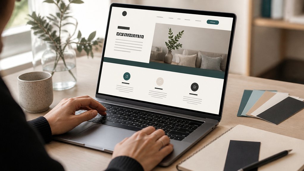
Ever noticed a site looks polished at a glance, yet you can’t quite say what’s different? It’s often the discipline of using just two fonts and a restrained palette. Pick one typeface for headings and one for body copy; that Typography pairing creates hierarchy without visual noise.
Aim for strong contrast: a confident sans for headings with a highly readable serif or sans for paragraphs. Check legibility on mobile and across common UK browsers.
Now set a simple palette: one primary brand colour, one accent, and two neutrals (typically white and charcoal). Use colour harmony to guide choices, then apply them consistently to buttons, links, and highlights.
Keep WCAG contrast in mind so text remains readable for everyone.
Use Consistent Photos, Icons, and Image Sizing
When you mix photo styles, icon sets, and image sizes, your website can look disjointed even if the layout’s solid. Choose one photographic direction—either bright, natural shots or moodier tones—and stick to it across every page, including team photos and product images.
Create rules for cropping and sizing: set standard aspect ratios (like 1:1, 4:3, or 16:9) and use them consistently so galleries and banners feel intentional. Keep image alignment predictable: align edges, match margins, and avoid random centreing that breaks rhythm.
For icons, pick one set and one stroke weight, then apply it everywhere for true icon consistency. If you’re using illustrations, keep line style and colour treatment consistent too.
Your site will instantly feel more polished and trustworthy to UK customers.
Improve Mobile Speed and Website Calls to Action

Because most UK customers browse on their phones, you need a site that loads fast on mobile and makes the next step obvious. Start with responsive design so buttons, menus, and forms stay thumb-friendly on any screen.
Then prioritise loading optimization: compress images, serve next‑gen formats, enable browser caching, and minimise scripts you don’t use. Test on 4G, not just office Wi‑Fi, and aim for a usable page in under two seconds.
Next, tighten your calls to action. Put one primary CTA above the fold on key pages, such as “Call now”, “Get a quote”, or “Book a visit”. Use contrasting colour, clear spacing, and click‑to‑call numbers with UK dialling codes.
Keep forms short and confirm what happens next.
Conclusion
You don’t need a full rebrand to look polished — you need clarity. Make your pages easy to scan, keep your branding consistent, and stick to two fonts with a tight colour palette. Match your photos, icons, and image sizes so nothing feels “off”. Then check the real test: mobile. Speed it up, put your call to action above the fold, and remove friction. Do that, and your site won’t just look professional — it’ll convert.