


You’ve got about five seconds to convince a UK visitor you’re legitimate, and most decisions happen before they scroll. If your navigation’s unclear, your branding shifts, or your policies are buried, trust drops and bounce rates climb. You build confidence by showing real contact details, consistent design, transparent pricing, and visible security cues like HTTPS and recognised payment badges. Add verifiable reviews and fast, accessible pages, and you’ll see why one small change often makes the difference…
Key Takeaways
- Build instant credibility with consistent branding, clear hierarchy, and predictable navigation; users form trust judgments within five seconds.
- Make trust pages prominent: About, Contact, delivery/returns, privacy, and key terms; use plain English and surface them near checkout.
- Reduce friction with simple menus, mobile-friendly tap targets, search and breadcrumbs, and obvious next steps like “Contact” or “Buy.”
- Signal security and transparency using HTTPS, recognizable payment icons, GDPR clarity, and upfront total pricing including VAT, delivery, and fees.
- Prove reliability with verified reviews, client logos, measurable case studies, fast load times, and accessible design aligned with Core Web Vitals and WCAG.
What Users Judge in the First 5 Seconds
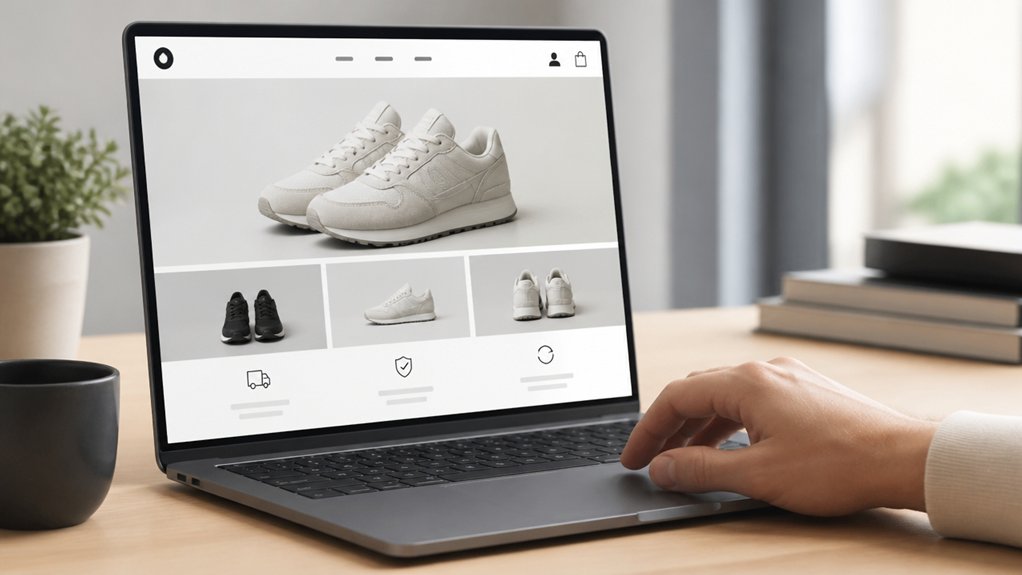
Although you’ve got longer to prove your value, most users form a trust judgement within the first 5 seconds of landing on your site, and that snap decision hinges on a few visible signals: clear branding, a professional layout, readable typography, and obvious next steps.
In the UK, where price comparison is easy and scepticism is high, you can’t waste that window. You need strong visual hierarchy so the eye lands on your headline, proof points, and primary CTA in order, without hunting.
Use spacing, contrast, and consistent components to signal competence. Apply color psychology with restraint: calm blues and greens often read as dependable, while harsh reds can feel salesy unless used for alerts.
Keep above-the-fold copy plain-English, and make navigation predictable across mobile and desktop.
Must-Have Trust Pages (About, Contact, Policies)
To sustain trust beyond the first 5 seconds, you need three pages that UK users expect to find fast: About, Contact, and Policies.
You build credibility when your About page tells a clear, verifiable story.
Your Contact page offers easy options (phone, email, address, and hours).
And your policies state delivery, returns, and privacy in plain English.
You reduce hesitation—and increase conversions—by making these pages prominent, consistent, and easy to scan on mobile.
Clear About Page Story
When a visitor clicks “About” on your site, they’re checking whether you’re real, accountable, and worth their time. You can’t leave them guessing; UK shoppers are quick to bounce when credibility feels thin.
Lead with what you do, who you serve, and why you exist, then back it with specifics: years trading, sectors, and measurable outcomes.
Use Authentic storytelling to show your origin, values, and decision-making, not vague mission statements.
Add Visual authenticity with real team photos, your workspace, and UK cues like Companies House details, VAT number, and trading address.
Include short bios that name roles and expertise, plus a timeline or milestones for proof.
Keep it skimmable with headings, bullets, and dates so trust forms fast.
Easy Contact Options
A strong About page earns initial belief, but easy contact options are what turn that belief into confidence, especially for UK shoppers who expect quick, verifiable routes to a real person.
Put Contact in your top nav and footer, and show a UK phone number, email, and local address so visitors can validate you fast.
Add Interactive chat for real-time reassurance during high-intent moments like delivery questions and checkout friction.
When chat’s offline, offer an easy form with minimal fields, clear response times, and consent wording that aligns with UK expectations.
Reinforce credibility with business hours in GMT/BST and a map pin for click-to-route.
Track contact-page visits, chat starts, and form completion rates; rising engagement usually signals reduced doubt and stronger purchase intent.
Transparent Policy Pages
Why do policy pages matter so much to UK shoppers? Because they reduce risk at the moment of purchase. When you show clear Privacy, Returns, Delivery, and Complaints policies, you answer privacy concerns and cut user skepticism before it turns into abandonment.
Make your About page specific: UK address, company number, VAT status, and real team or mission details.
On Contact, list hours, phone, email, and response times.
On policies, use plain English, upfront costs, and timelines aligned to UK expectations (including the Consumer Contracts Regulations for online returns).
Put key terms near “Add to basket” and link every page in the footer.
You’ll convert more visitors when they can verify who you’re and exactly what happens if something goes wrong.
Navigation That Makes Your Site Feel Effortless
Although your visuals set the tone, your navigation is what decides whether people stay, explore, and ultimately trust you. In the UK, users expect to find what they need fast; when they don’t, they leave.
Build intuitive menus that mirror how customers think: Services, Pricing, Support, and clear contact options. Keep labels plain English, not internal jargon, and limit top-level choices to prevent decision overload.
Seamless navigation means predictable paths on every page: a consistent header, visible search, and breadcrumbs for deeper content. Make mobile tap targets generous and keep key actions within thumb reach, because most UK traffic is mobile-first.
Finally, highlight trust-critical routes—Returns, Delivery, Complaints, and Accessibility—so you reduce friction, increase confidence, and lift conversion without pushing users to hunt.
Consistent Branding That Feels Real (Not Random)

When your branding stays consistent across every page, you signal reliability in seconds—something UK users weigh heavily before they share details or spend. Keep your logo placement, colour palette, typography, and tone locked in, so visitors don’t wonder if they’ve landed on a different firm or a spoofed page. That’s brand consistency at work: it reduces cognitive load and increases perceived legitimacy.
Build visual harmony by standardising buttons, form styling, icon sets, and imagery treatment, then apply the same spacing and grid rules site-wide.
Back it up with measurable checks: run a simple page-audit for mismatched fonts, rogue colours, or inconsistent UI components, and fix them. Consistency also strengthens recall, so returning users recognise you instantly across mobile and desktop.
Copy That Answers “What Happens Next?
Consistent branding gets users to believe they’re in the right place; clear copy then confirms they’re safe to take the next step. You reduce customer skepticism when you spell out the journey in plain UK English: what you’ll ask for, how long it takes, and what confirmation they’ll receive.
Use action-led microcopy beside each button: “Continue to details”, “Check your inbox for a link”, “We’ll call within 1 working day”. Pair it with timely reassurance: “You can save and return”, “We’ll send a reference number”, “No card needed to book a callback”.
Data backs this up: UK usability tests consistently show task completion rises when next-step expectations are explicit. When your words match your process, you signal brand authenticity and keep momentum.
Transparent Pricing and Policies (No Surprises)
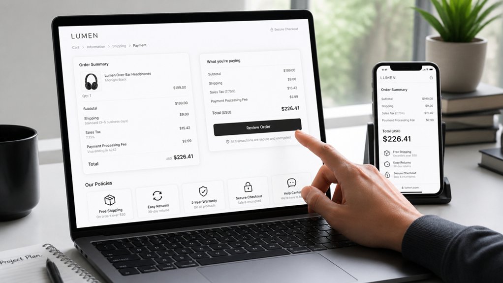
Because hidden costs trigger immediate drop-offs, you build trust faster by putting total pricing and key policies upfront in plain UK terms—VAT included or excluded, delivery and returns, cancellation windows, and any ongoing fees.
Show the “all-in” basket price before checkout and repeat it on mobile, where comparison shopping is ruthless.
Use Pricing transparency: clear unit costs, minimum terms, and renewal dates beside the CTA, not buried in FAQs.
Back it up with Policy clarity: a one-scan summary of returns timelines, refund methods, and who pays return postage.
If you use subscriptions, state billing frequency, price rises, and how to cancel in two clicks.
Add examples (“£29/month + VAT”) to prevent confusion and reduce support tickets.
Security and Privacy Signals Users Look For
Even if your offer is solid, UK users will still hesitate if your site doesn’t show clear security and privacy cues at a glance. Put HTTPS front and centre, avoid mixed-content warnings, and explain your Encryption protocols in plain English near checkout and forms. Use recognisable payment icons, but back them with links to your security page and incident-response process.
Show GDPR-ready handling without legal fog: state what you collect, why, and how long you keep it. Add just-in-time privacy notices beside fields, not buried in footers. Offer granular cookie controls that work on first load and log consent. Where you can, use data anonymization for analytics and say so.
Make account security visible with 2FA, password rules, and session timeouts.
Social Proof That Actually Builds Credibility
You build credibility faster when you put trust signals above the fold, where UK users typically decide in seconds whether to stay or bounce.
You should show recognisable client logos, verified ratings, and compliance markers prominently, so visitors don’t have to hunt for proof.
You then back it up with case studies that lead with hard metrics—conversion lift, cost reduction, or time saved—so the value reads as evidence, not opinion.
Trust Signals Above The Fold
Where do visitors decide whether to trust your site—before they scroll? For most UK audiences, that judgement happens above the fold, so you must place credible proof where eyes land first.
Use visual hierarchy to prioritise one clear value promise, then anchor it with recognisable trust markers: Trustpilot or Google rating, client logos, sector accreditations (ISO, Cyber Essentials), and “Secure checkout” with PCI/SSL cues.
Keep claims specific (“4.8/5 from 2,300+ reviews”) and link to the source to reduce scepticism.
Apply color psychology with restraint: blues and greens signal stability, but high-contrast buttons still need calm surrounding space.
Add human cues—real names, UK locations, and recent review dates—so reassurance feels current and verifiable.
Case Studies With Metrics
Because generic testimonials feel easy to fake, case studies with hard numbers do far more to earn trust with UK visitors. You should show before-and-after metrics tied to a clear goal: conversion rate, checkout drop-off, lead quality, or call volume.
Include timeframes, sample sizes, and the tool used (GA4, Hotjar, CRM) so Customer perception shifts from “marketing” to “evidence”.
Build each study like a mini audit: problem, hypothesis, design changes, and results. For example: “Reduced form fields from 9 to 5; enquiry completion rose 27% in 6 weeks; CPA fell 18% across Google Ads.”
Add a client quote, but anchor it to the numbers. That’s credibility enhancement you can measure, not just claim.
Fast, Accessible UX That People Trust
When a page loads in under a couple of seconds and works cleanly with keyboards, screen readers, and mobile networks, it signals competence—one of the most crucial routes to trust. In the UK, where shoppers compare options quickly, your loading speed shapes perceived reliability before copy gets read.
Optimise images, use server-side caching, and trim scripts so Core Web Vitals stay healthy on 4G and commuter Wi‑Fi.
Pair speed with accessibility features: clear focus states, logical headings, alt text, and form labels that work with assistive tech. You’ll also reduce abandonment by making journeys smoother for everyone, including older users and people with impairments.
Align to WCAG and test with real devices; publish an accessibility statement to show accountability. Fast, inclusive UX feels honest, and honesty converts.
Conclusion
Trust doesn’t trickle in—it hits you in the first 5 seconds like a shopfront on the high street. If your navigation’s frictionless, branding’s consistent, and your About, Contact, and policy pages are easy to find, you’ll look legitimate. Add clear “what happens next” copy, transparent pricing, and visible security signals (SSL, ICO-ready privacy). Back it with UK reviews and case studies, and a fast, accessible UX—then you’ll convert clicks into loyal customers.