


You don’t need a redesign to look more credible—you need a few high-impact fixes. When you add real testimonials with names and measurable outcomes, show verified trust badges, and make your contact details and policies easy to find, you reduce doubt fast. Pair that with faster load times, mobile-first layout, and cleaner typography, and your conversion path gets smoother. The question is which upgrades move trust the most in the next 10 minutes…
Key Takeaways
- Add a clear headline that states who you serve and the outcome you deliver in plain language.
- Place a strong testimonial above the fold, including name, role, and a measurable result.
- Display transparent contact details—real email, phone number, and location or service area—prominently on every page.
- Add trust signals near CTAs and forms, like client logos, review counts, third-party ratings, and security badges.
- Link your privacy policy next to forms and explain how data is used to reduce perceived risk.
Start With the 10-Minute Credibility Website Upgrades

If you only have 10 minutes, you can still make credibility upgrades that reduce doubt and increase conversions.
Start with a quick credibility assessment: scan your homepage for missing trust signals, unclear value, or dated content.
Add a clear headline that states who you help and the outcome you deliver.
Place one strong testimonial with a name, role, and measurable result above the fold.
Verify your contact options: show a real email, phone, and location or service area.
Update your About snippet to lead with credentials, years, or client counts.
Enforce branding consistency by matching colors, typography, and tone across header, buttons, and footers.
Finally, tighten your calls to action so each page answers “What’s next?” without confusion.
Speed Up Your Site (Fast Website Upgrades)
After you’ve nailed quick credibility wins, you’ll get the biggest performance gains by cutting load time—because even a 1-second delay can reduce conversions.
You’ll optimize images and media, minify code and scripts, and remove unnecessary weight from every page request.
Then you’ll enable caching and a CDN so repeat visitors and global users get fast, consistent load times that protect your leads and revenue.
Optimize Images And Media
Because media files often make up the majority of a page’s weight, optimizing images and video is one of the fastest ways to cut load time and improve Core Web Essential metrics. Start with image compression: export photos as WebP or AVIF, and resize to the exact display dimensions to avoid wasting bytes. Serve responsive images with srcset so mobile users don’t download desktop assets.
Next, apply media optimization to video: replace autoplay backgrounds with lightweight poster images, and use short, muted, click-to-play clips when you need motion. Host video externally or stream with adaptive bitrate to reduce initial payload.
Lazy-load below-the-fold galleries so above-the-fold content renders first. Track results in PageSpeed Insights and Lighthouse; you should see lower LCP, reduced total transfer size, and fewer bounce-triggering delays on key landing pages.
Minify Code And Scripts
When your CSS and JavaScript ship with extra whitespace, comments, and unused code, you’re paying a crucial speed tax on every pageview. Minify assets to cut transfer size and parsing time, so pages render faster and feel more trustworthy.
You can automate Script minimization in your build pipeline (Webpack, Vite, or Rollup) to remove dead code, shorten identifiers, and bundle only what each page needs.
Pair it with Code compression techniques like gzip or Brotli at the server to shrink files further without changing functionality.
Track results in Lighthouse and Core Web Vitals: smaller JS typically improves Interaction to Next Paint and reduces Total Blocking Time.
The payoff is immediate—faster checkout flows, lower bounce rates, and fewer “site feels slow” complaints from clients.
Enable Caching And CDN
Minifying CSS and JavaScript cuts what you ship, but caching and a CDN cut how often and how far you have to ship it.
Set browser and server caching so repeat visitors load pages from local storage or memory, not your origin. Use strong Caching strategies: cache static assets for weeks, HTML for minutes, and purge on deploy. Add ETags or versioned filenames to prevent stale files.
With CDN integration, you serve images, fonts, and scripts from edge locations closer to customers, reducing latency and origin load.
Aim to improve Time to First Byte and Largest Contentful Paint; even a 100–300 ms drop can lift conversions and lower bounce.
Monitor cache hit ratio, set proper Cache-Control headers, and test with WebPageTest to confirm gains.
Make Your Site Mobile-First With Quick Upgrades
Most of your visitors are on phones, so if your buttons and links are hard to tap, you’re losing clicks and conversions. You can fix that fast by enlarging tap targets, adding spacing, and keeping key actions within thumb reach.
Next, you’ll cut mobile load time by compressing images, trimming scripts, and prioritizing above-the-fold content so your pages respond instantly.
Optimize Tap Targets
Even if your mobile layout looks polished, small tap targets can silently tank conversions by forcing users to zoom, miss, and abandon. On touch screens, precision drops, so your design must do the work for them.
Improve tap target accessibility by sizing primary buttons and links to at least 44×44 px and spacing them so accidental taps don’t happen. Expand the clickable area beyond the visible text for nav links, product filters, and form controls, especially checkboxes and radio buttons.
Keep key CTAs away from screen edges and fixed UI bars where thumbs collide. Then test with real thumbs: try one-handed use, fat-finger taps, and quick scrolling. When every tap lands confidently, you reduce friction, boost form completion, and look more trustworthy to mobile buyers.
Improve Mobile Load Speed
Because mobile users judge your site in seconds, slow load times don’t just hurt SEO—they cut conversions by raising bounce rates and lowering form and cart completion.
Audit speed with Lighthouse and real-user metrics (Core Web Vitals), then fix the biggest bottlenecks first.
Compress and serve next-gen images (WebP/AVIF), lazy-load below-the-fold media, and defer noncritical JavaScript so your main thread stays responsive.
Enable HTTP/2 or HTTP/3, use a CDN, and set strong caching headers to reduce repeat-load friction.
Minify CSS, remove unused scripts, and limit third-party tags that stall rendering.
Pair these changes with responsive design so you ship smaller assets to smaller screens.
Faster pages improve user experience, increase trust, and move more visitors into calls, demos, and checkouts.
Simplify Navigation So Key Info Is Obvious
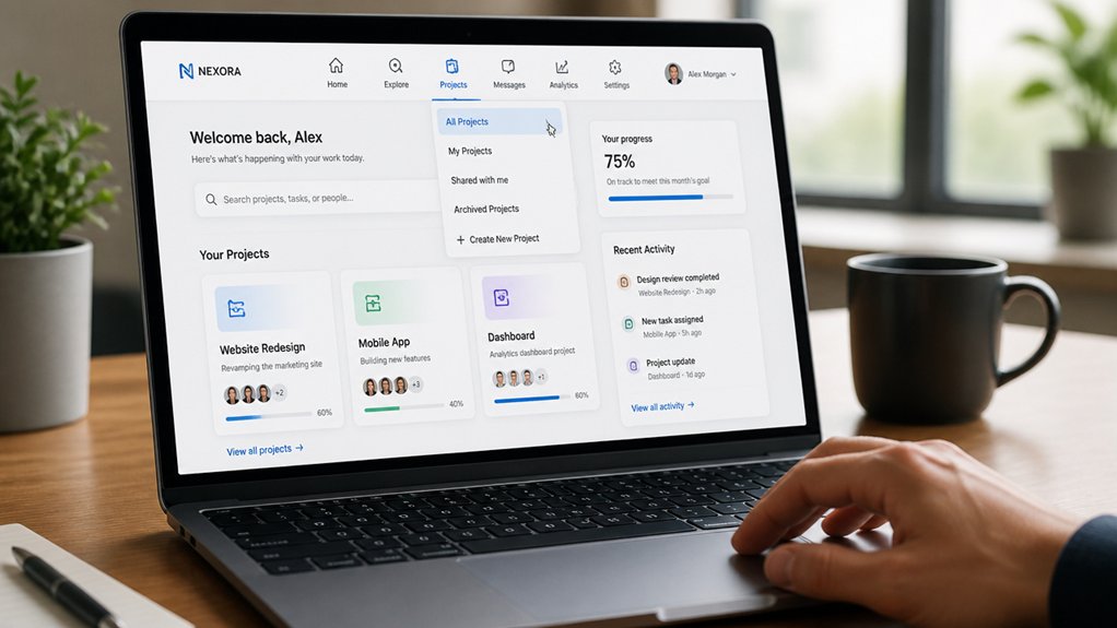
When visitors can’t spot pricing, services, or contact details within a few seconds, they’re more likely to bounce than keep hunting. You protect credibility by making your navigation answer “Where am I?” and “What’s next?” instantly—core user experience fundamentals tied to higher user engagement.
Limit your top menu to 5–7 clear labels, prioritize customer tasks (Services, Pricing, About, FAQ, Contact), and use plain language over clever terms.
Add a persistent header with a click-to-call phone number and a dedicated Contact link; on mobile, keep it thumb-friendly.
Group related pages with dropdowns only when necessary, and mirror your menu in the footer for fast access.
Track improvement with click-through rates and time-to-contact, then iterate based on real behavior.
Strengthen Above-the-Fold Messaging and CTA
Clear navigation gets visitors to the right page. Above-the-fold messaging makes them act once they land. Lead with a specific value proposition that answers “Why you?” in five seconds, using plain language your clients already use.
Keep Brand consistency tight: match your promise to your service, proof points, and tone, so nothing feels mismatched or risky. Then place one primary CTA above the fold and make it outcome-driven (e.g., “Get a 15-minute estimate” vs. “Submit”). Reduce choice: one CTA, one supporting link, no competing offers.
Add trust signals near the CTA—client logos, review count, or a quantified result—to lift conversions. Track User engagement with scroll depth and CTA clicks, and iterate weekly.
Modernize Typography, Spacing, and Visuals
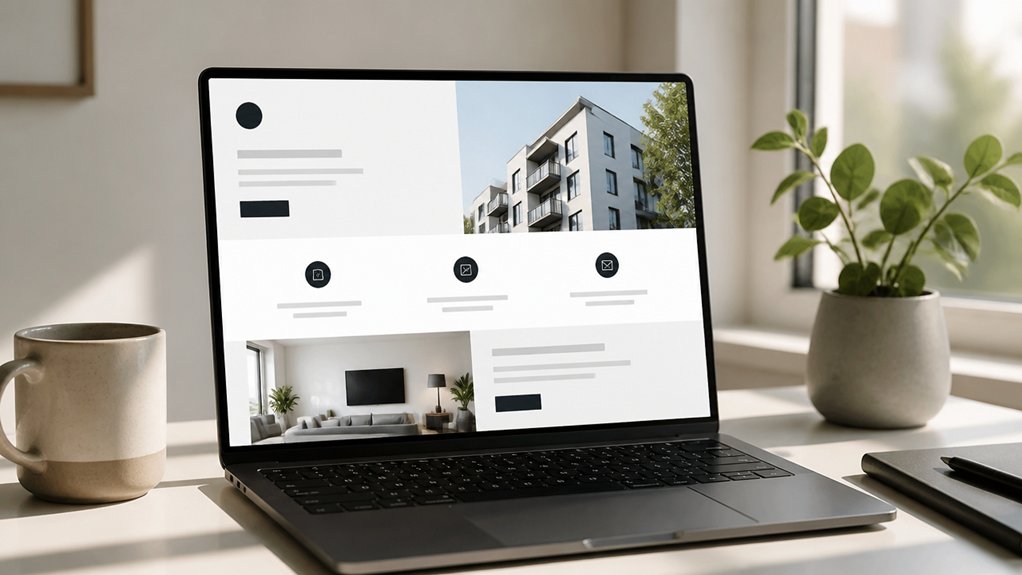
Even if your copy is strong, dated typography and cramped spacing can make your site feel untrustworthy in seconds. Clean, modern type and breathable layouts signal competence because users judge credibility fast and visually.
Standardize your type scale, limit fonts to two families, and enforce typography consistency across headings, buttons, and body text so pages feel unified.
Increase line-height, widen margins, and use clear section breaks to reduce cognitive load and improve scanning.
Refresh visuals with high-resolution, on-brand images and consistent icon styles; mismatched stock photos erode confidence.
Use a restrained palette with strong color harmony, ensuring accessible contrast for readability on mobile.
Finally, audit every template: one system for fonts, spacing, and components eliminates “patchwork” design and raises perceived quality.
Add Trust Signals and Friction-Free Forms
Modern typography and spacing earn you a first look, but trust signals and low-friction forms earn you the inquiry. Add Trust badges near CTAs, pricing, and checkout to reduce perceived risk and lift conversions. Show real reviews, recognizable client logos, and third-party ratings, and keep them current—stale proof erodes confidence fast. Link clear Privacy policies beside every form so visitors know how you’ll use their data.
Then remove friction: ask only what you’ll act on, split long forms into steps, and use inline validation to prevent errors. Enable autofill, add a “preferred contact method” option, and confirm submission instantly with next steps.
When you make it easy to trust you and easy to respond, you’ll get more qualified leads.
Conclusion
You’ve just swapped flickering bulbs for steady light. In 10 minutes, you speed up pages, tighten mobile layouts, and make navigation obvious—so visitors don’t bounce. You sharpen above-the-fold messaging and a single CTA, then modernize type and spacing to reduce cognitive load. Finally, you add proof: named testimonials with measurable outcomes, trust badges, and clear contact details, plus privacy links near forms. These upgrades turn hesitation into clicks and leads.