

You don’t need a full redesign to lift conversions—you need to remove the blockers that slow users down and weaken trust. If your mobile load time drags past 3 seconds, or your headline doesn’t answer “why you” in five seconds, you’re leaking leads. Tighten your above-the-fold message, add proof where decisions happen, and simplify the next step with clearer CTAs. Start with the seven issues most small sites miss…
Key Takeaways
- Speed up pages by compressing images, lazy-loading media, minifying CSS/JS, and deferring non-critical scripts to reduce bounce and boost conversions.
- Rewrite above-the-fold messaging to state who you help, the outcome you deliver, and the next step in one clear headline.
- Strengthen trust at decision points with recent testimonials, case studies, logos, and quantifiable results placed near forms, pricing, and CTAs.
- Improve CTAs and navigation with fewer menu items, benefit-led buttons, supportive microcopy, and thumb-friendly mobile layouts that guide users to one action.
- Simplify forms and checkout by removing fields, enabling guest checkout, showing total cost early, adding progress indicators, and offering Apple Pay/Google Pay.
Quick Website Refresh Audit: 7 Conversion Blockers
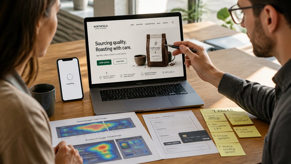
If your traffic looks healthy but your leads or sales don’t match, your site likely has a few high-friction issues that quietly stop visitors from converting. Run a quick audit in analytics, heatmaps, and form reports to spot seven blockers fast.
First, slow pages: every extra second cuts conversion rate.
Second, weak User engagement signals—high bounce, low scroll—often trace to mismatched intent.
Third, confusing navigation that hides key pages.
Fourth, broken tracking or missing events, so you can’t optimize.
Fifth, forms that ask too much, fail validation, or lack autofill.
Sixth, inconsistent Content strategy: outdated offers, thin service pages, or no proof near decision points.
Seventh, mobile friction: tiny tap targets, pop-ups, and sticky elements covering CTAs.
Fix these and you’ll lift conversions.
Fix Your Homepage Message Above the Fold
Because most visitors decide whether to stay within a few seconds, your above-the-fold homepage message has to answer three questions fast: what you do, who it’s for, and what to do next. If you can’t say it in one headline and one supporting line, you’re losing attention and clicks.
Make your Homepage messaging concrete: name the service, the outcome, and the audience (“Bookkeeping for solo therapists” beats “Financial clarity”).
Use proof signals above the fold: a quantified result, review count, or recognizable client logos to reduce perceived risk.
Remove vague taglines, rotating sliders, and stock photos that don’t explain value.
Match the message to intent by echoing your top traffic keywords and offers from ads, search, and referrals.
Test variants with analytics and session recordings weekly.
Upgrade Your Calls-to-Action (Copy + Design)

Even when your offer is strong, weak calls-to-action leak conversions by making the next step feel unclear or low-value. Upgrade your CTA copy to be specific, benefit-led, and low-friction: “Get a 10-minute quote,” “See pricing,” or “Book a call” beats “Submit.”
Add microcopy that removes doubt (response time, no spam, cancel anytime) and match each button to intent.
Use call to action strategies backed by testing: run A/B tests on verb, value, and placement, and track clicks, form starts, and completions—not just pageviews.
Then apply visual design enhancements: high-contrast buttons, ample whitespace, consistent shapes, and clear hover states. Keep one primary CTA per section, demote secondary links, and make CTAs thumb-friendly on mobile.
Refresh Key Landing Pages for Paid and SEO Traffic
Strong CTAs only convert when the page around them matches the visitor’s intent, so refresh your key landing pages for the traffic you actually buy and earn.
Start by mapping each ad group and top organic query to a dedicated page, then align headline, proof, and offer to that promise.
Use Keyword optimization to match on-page terms to query language, but keep it human and benefit-led.
Tighten above-the-fold copy, add one clear value prop, and surface the 2–3 trust signals your buyers look for most (reviews, guarantees, turnaround time).
Use Content personalization to swap examples, industries, or location cues based on campaign, device, or referrer.
Track scroll depth, form starts, and cost per lead, then A/B test sections, not just buttons.
Simplify Navigation So Visitors Find the Next Step

When your navigation forces visitors to think, they bounce—so streamline it to move people to the next step faster. Audit your top pages in analytics and map the shortest route to “Book,” “Get a Quote,” or “Buy.” If it takes more than two clicks from your homepage, you’re adding friction.
Improve menu clarity by limiting primary items to 5–7 and labeling them with intent-first language (“Pricing,” “Services,” “Contact”) instead of clever names. Group related pages under one dropdown, and remove dead-end links that don’t support conversions.
Build user pathways with consistent CTAs in the header and key pages, so visitors always see the next action. Then A/B test one navigation change at a time and track click-through to your main conversion page.
Speed up Mobile Load Time With Quick Wins
Mobile users bounce fast—every extra second you make them wait can cut conversions, so you need quick load-time wins.
Start by compressing images and media so your pages stay sharp but ship fewer bytes over cellular connections.
Then minify your scripts and stylesheets to reduce file size and render-blocking, so checkout, calls, and contact forms load before your visitors leave.
Compress Images And Media
A few oversized images can quietly add seconds to your load time—and every extra second increases bounce rates and cuts conversions. On mobile, that delay feels like friction, so you need Image compression and media optimization to keep shoppers moving toward your CTA.
Start by resizing images to the maximum display size (not 4000px “just in case”). Then export modern formats like WebP or AVIF. Aim for sharp visuals under 150KB for most page images, and compress hero banners aggressively without visible artifacts.
Replace autoplay background videos with lightweight poster images and a tap-to-play option. Use responsive image variants so phones don’t download desktop files.
Finally, lazy-load below-the-fold media and prioritize above-the-fold visuals so your first screen renders fast.
Minify Scripts And Stylesheets
Even if your images are perfectly optimized, bulky JavaScript and CSS can still delay interactivity, trigger layout shifts, and cost you conversions—especially on slower phones and spotty connections.
Minify and compress files to strip whitespace and unused code, then serve them with Brotli or gzip.
Prioritize script optimization: defer non-critical scripts, load analytics after consent, and code-split so product and checkout pages only ship what they need.
Tighten stylesheet management by removing unused selectors, inlining critical CSS for above-the-fold content, and delaying the rest.
Aim for a faster Largest Contentful Paint and lower Total Blocking Time; both correlate with higher mobile conversion rates.
Re-test with Lighthouse and real-device throttling, then iterate until taps feel instant.
Add Trust Signals: Reviews, Proof, Guarantees
While your design can grab attention, trust signals close the sale by reducing perceived risk and answering the unspoken question, “Can I rely on you?” Add visible, specific proof—recent customer reviews with names and dates, case-study results with before-and-after metrics, recognizable certifications, and a clear guarantee—so visitors don’t have to guess.
Place Customer testimonials near key decision points: service pages, pricing sections, and “Get a quote” CTAs. Use review snippets that quantify outcomes (“cut downtime 32%,” “saved $1,200/month”) and link to full stories for credibility.
Add Trust badges only if they’re verifiable—payment security, industry memberships, BBB, or platform partner status—and keep them consistent sitewide.
Spell out your guarantee in plain language with limits and timelines. The goal: shorten evaluation time, increase confidence, and lift conversions without changing your offer.
Remove Friction From Forms (And Checkout)
Trust signals build confidence, but friction in your forms or checkout can still kill the conversion at the last step. Audit every field like it’s a cost: if it doesn’t help fulfill, verify, or follow up, cut it.
Prioritize Form usability with one-column layouts, clear labels, autofill, and mobile-friendly inputs. Use inline validation so you fix errors instantly, not after a rage-inducing submit.
For checkout simplification, offer guest checkout, show total cost early, and keep shipping and payment on as few steps as possible. Add progress indicators, save carts automatically, and support fast wallets (Apple Pay, Google Pay).
Reduce distractions, remove forced account creation, and confirm security with concise microcopy. Every removed click shortens time-to-complete and lifts completions.
Track Your Website Refresh With 5 Metrics
Before you call your website refresh “done,” lock in five metrics that show whether the changes actually improved user behavior and conversions.
First, track conversion rate by primary goal (lead form, checkout, call).
Second, watch funnel drop-off by step to confirm you removed friction.
Third, measure engagement quality: scroll depth and time on key pages, not sitewide averages.
Fourth, monitor return visitor rate and email capture rate to gauge trust and intent.
Fifth, validate traffic efficiency with cost per lead and revenue per session if you run ads.
Use Audience segmentation to compare new vs returning, mobile vs desktop, and top channels.
Then test Content personalization: personalize headlines or offers and measure lift with A/B tests.
Review weekly and act fast on outliers.
Conclusion
You don’t need a full redesign to lift conversions—you need fewer blockers. Tighten your above-the-fold message, make CTAs impossible to miss, speed up mobile load, and add proof where decisions happen. For example, a local HVAC company cut mobile load time from 5.2s to 2.1s, swapped “Contact Us” for “Get a Same-Day Quote,” and added 40 Google reviews—leads rose 27% in 30 days. Track speed, CTR, form completion, bounce rate, and revenue.