

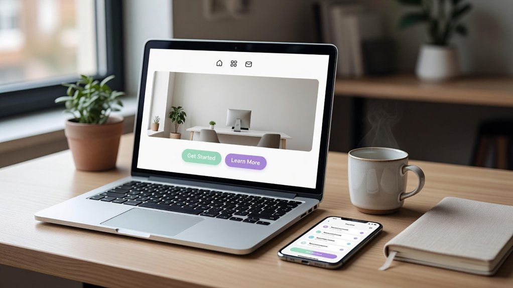
Your small business website is like a shopfront on a busy high street, and most passers-by are now on mobiles. In the UK, mobile-first, thumb-friendly menus and sub‑2‑second load times are becoming essential as Core Web Vitals tighten. You’ll also see a shift to modern type, restrained colour, and real photos that prove you’re local, plus lean landing pages with clear CTAs. The next step is where most sites still lose leads…
Key Takeaways
- Mobile-first, thumb-friendly layouts use sticky bottom CTAs, 44px tap targets, and simplified menus to reduce friction.
- Speed and Core Web Vitals optimization targets sub-2-second loads, improved LCP/INP/CLS, compressed media, and reduced render-blocking scripts.
- Authentic branding favors real photography, consistent typography, and subtle edits to build trust and stand out from generic templates.
- Conversion-focused landing pages prioritize one goal, a single above-the-fold CTA, and short forms with click-to-call and local intent features.
- Trust signals are increasingly prominent, featuring reviews, transparent pricing, delivery windows, and clear privacy cues with measurable GA4 event tracking.
Top Small Business Website Design Trends for 2026
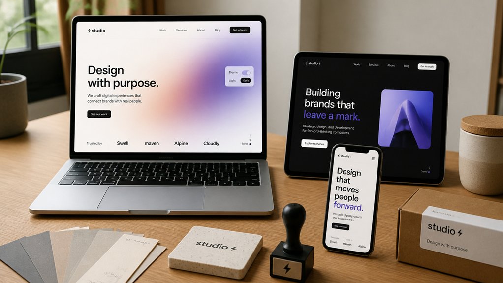
As UK consumer expectations keep rising, the top small business website design trends for 2026 focus on measurable gains in speed, accessibility, and trust signals. You’ll prioritise Core Web Vitals, compress media, and ship leaner fonts so pages load in under 2 seconds on typical UK 4G.
You’ll use accessibility enhancements like higher colour contrast, visible focus states, keyboard-first navigation, and clearer error messaging to reduce drop-offs and meet WCAG-aligned procurement demands.
You’ll strengthen trust with prominent reviews, real-time stock and delivery windows, and transparent pricing, boosting conversion in sectors hit by comparison shopping.
You’ll bring Brand storytelling to life with short founder-led video, proof-backed impact stats, and case studies tailored to local regions.
You’ll track results via GA4 events, not guesswork.
Mobile-First Design With Thumb-Friendly Menus
Because over 70% of UK small business traffic now lands on mobile, you’ll get better results by designing for thumbs first and desktops second.
Prioritise thumb navigation by placing primary actions (call, book, buy, get a quote) in the lower third, where most users naturally tap. Use a sticky bottom bar or compact hamburger with clear labels, not mystery icons, and keep tap targets at least 44px to reduce mis-taps.
For mobile optimization, streamline your menu to 5–7 top-level items and surface local intent: “Find us”, “Opening times”, and “WhatsApp” perform strongly for UK service firms. Add one-tap click-to-call and postcode search.
Then scale up to desktop, rather than squeezing down. Test on iPhone and Android devices weekly.
Fast-Loading Small Business Websites (Core Web Vitals)
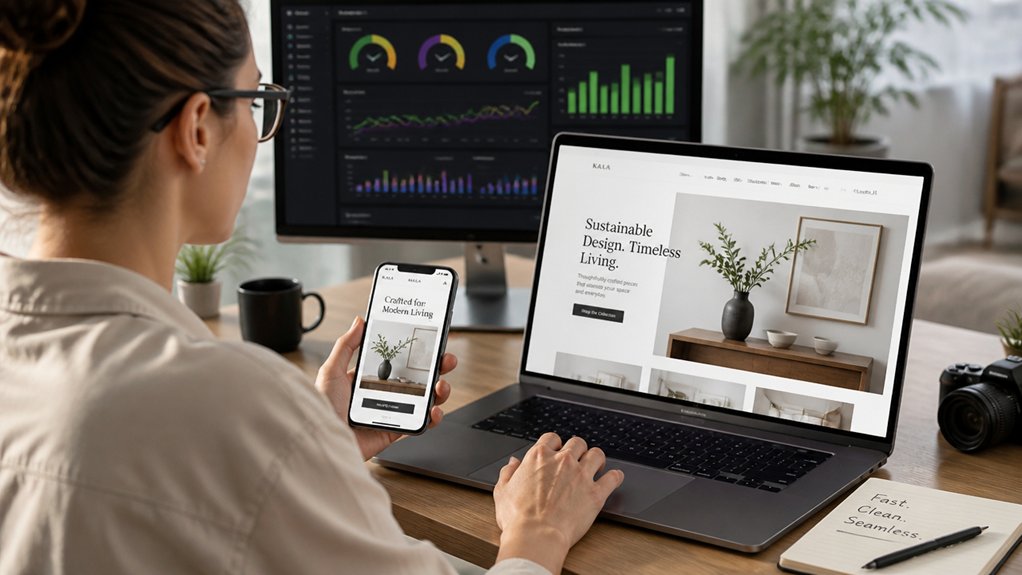
While your design can look flawless on mobile, it won’t convert if the page feels slow. UK shoppers expect near-instant results, and Google’s Core Web Vitals now shape visibility and trust. Prioritise site speed by hitting strong targets for LCP, INP, and CLS, because delays and layout shifts kill checkouts and calls.
You’ll improve user engagement when you compress and serve next-gen images, preload critical assets, and remove render-blocking scripts. Use a UK-based CDN, enable HTTP/2 or HTTP/3, and cache aggressively to cut latency for regional traffic.
Audit with PageSpeed Insights and Search Console, then fix what’s measured, not what’s guessed. Faster pages reduce bounce rates and support better local SEO performance across competitive UK niches today.
Modern Typography, Color, and Authentic Photos
If your typography, colour palette, and imagery don’t signal credibility in the first few seconds, UK visitors bounce and your enquiries drop.
Your best lever is consistency: pick one modern sans for UI and one readable serif or humanist for headings, then set a clear type scale for mobile-first layouts.
This Typography evolution trend favours variable fonts, tighter line lengths, and stronger hierarchy, so your key messages scan fast on commuter screens.
Use Color psychology to guide choices: blues and greens often support trust and sustainability, while warm accents direct attention without shouting.
Skip glossy stock shots; UK audiences respond to real teams, real premises, and real product details.
Shoot in natural light, show faces, and keep edits subtle for authenticity.
Landing Pages and Micro-UX That Increase Leads
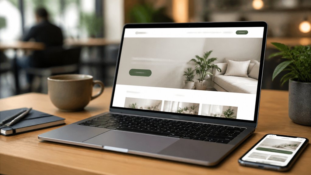
When you design landing pages around one clear job-to-be-done, you cut friction and lift lead volume—especially on mobile, where most UK sessions now happen.
Keep a single CTA above the fold, compress forms to 3–5 fields, and use click-to-call for local intent. UK users expect speed: hit Core Web Vitals targets and you’ll reduce bounce and improve quality scores in paid search.
Micro-UX wins come from testing: add Personalized content by location, sector, or returning-visitor status, and tailor proof (reviews, accreditations, delivery windows) to match.
Use Interactive elements like calculators, availability checkers, and short quizzes to qualify leads without extra pages.
Finish with sticky consent, clear privacy cues, and instant confirmation to prevent drop-off.
Conclusion
If you want your small business site to win in 2026, you’ll build mobile-first for UK thumbs, not desktop mice. You’ll keep load times under 2 seconds and protect Core Web Vitals, because every delay leaks leads. You’ll pair modern type and colour with real photos that feel local, not stock. You’ll run conversion-focused landing pages, clear CTAs, and short forms. Done right, your website becomes a high street shopfront—open 24/7.